Missed Connections
Will Hailey break downs what teams got right and got wrong on the 2024 City Connect jerseys so far
Matt, Kevin, and myself will be ranking City Connect jerseys this week on No Dowd About It! Here are my thoughts on the jerseys we have gotten so far in 2024.
Tampa Bay Rays
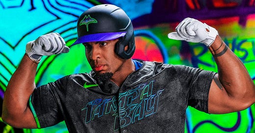
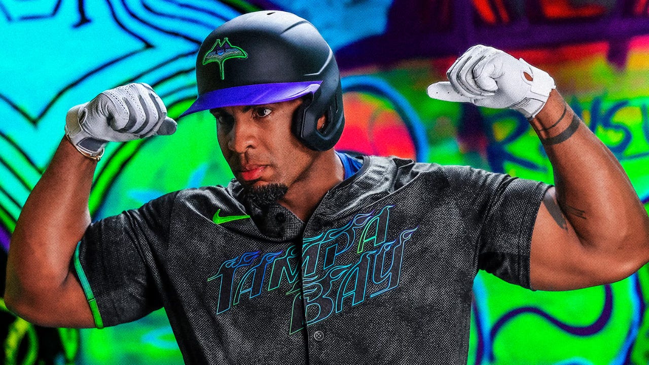
Let’s start with by far the best City Connects of 2024, the Tampa Bay Rays. The Rays chose to represent Tampa’s (apparently?) historic skateboarding community with flaming wordmarks, a bright neon color scheme, new logos, and a grip tape textured letters.
What They Got Right:
Almost everything. City Connects should be fun and wearable and Tampa/Nike understood the assignment and hit a home run here. The Rays as a franchise are less than 30 years old, making the decision to promote youth and counterculture in their design the right choice. The SkyRay logo on the hat is exceptional, only to be bested by our lord and savior Evan Longboardia, the Skating Ray alternate logo. The bright purples, blues, and greens play beautifully off the black. The “Glow and Grit” branding is so good it feels like a letdown now to see the team in their regular jerseys with uneventful shades of blue with hints of yellow.
What They Got Wrong:
My only critique of the “Glow and Grit” concept is the dark letters and numbers on top of dark jerseys. While you can read them up close, the neon green last names are the only thing on the jersey you can make out on a broadcast. Making the letters and numbers their bright gradient colors, or at least thickening the outline significantly, would have made these the best City Connects yet.
Cleveland Guardians
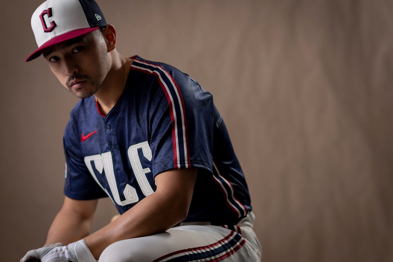
The Guardians just introduced their City Connects that put some modern rebrand elements on Major League 2 era racing stripe jerseys. Everything they got right is somehow also what they got wrong.
What They Got Right and Wrong:
The white panel hat is beautiful BUT it does not stray far from the regular branding. Similarly, the darker navy and deeper red look awesome together alongside the white BUT they missed an opportunity to bring in something unique and different. The marbling on jersey make sense with the concept and textured jerseys are usually a win BUT they are so dark that it is hard to tell what it is which makes just makes them look vaguely dirty. The font works BUT stop doing abbreviations for cities that do not go by their abbreviation! The guardian statue holding a bat logo is sick, no “but”. The City Connects do not push boundaries or do much that qualifies ~fun~, BUT the elements are strong and an entire Guardians brand overhaul around this concept would be *chefs kiss*.
Philadelphia Phillies
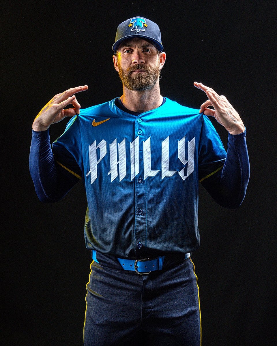
The jerseys are called City CONNECTS. Philly did an incredible job connecting elements of the city’s past that no one asked for with elements of the future nobody wanted in these blue gradient jerseys.
What They Got Right:
While Philly has taken a lot of well deserved heat, there are aspects they nailed. The Liberty Bell logo on the hat is terrific. Utilizing the bell line the “City of Brotherly LOVE” logo is great. Alright, that is two things they got right which is really just one thing!
What They Got Wrong:
First, the colors. Why? Second, can we please end the desire for dark navy pants on nearly every City Connect set? The gradient is also completely unnecessary. The idea behind the founding father script “Philly” is sound, but in practice is too much and does not match the rest of the concept. These jerseys look like three entirely different concepts poorly mashed into one.
New York Mets
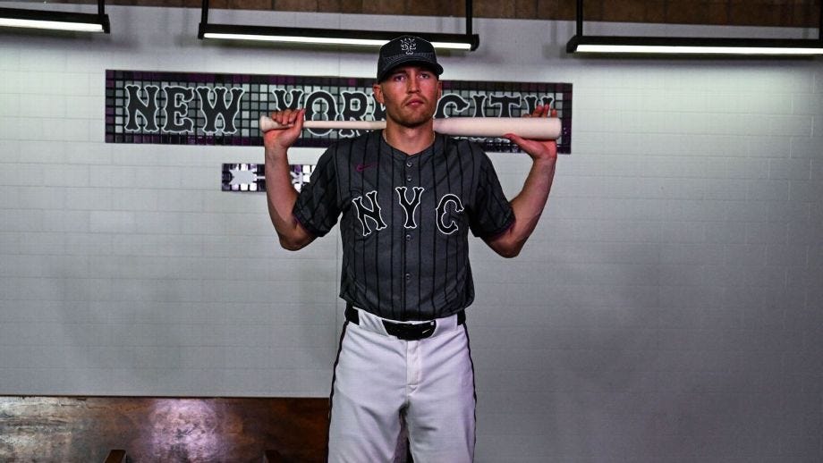
The Mets stuck to a theme as well as anyone with their concrete jungle jerseys with 7 Train purple accents and Queensboro bridge hats.
What They Got Right:
Sticking to a damn theme! Every piece of these jerseys makes sense for New York City generally and the Mets and Queens specifically. They went out of the box putting the Queensboro bridge on the front panels of the hat which is a huge win. New York City is one of maybe three cities that should be getting away with putting the city abbreviation on the jersey and putting NYC instead of Queens was the right decision.
What They Got Wrong:
Executing the damn theme! These jerseys are too dark. They make sense with the concrete jungle concept, but they are not cool or fun or wearable. The 7 Train purple is the best part of the jersey and it goes completely underutilized. As frustrating as all the dark pants have been in most City Connect uniforms, these seem to be the jerseys that would fit best alongside matching dark gray pants.
Detroit Tigers
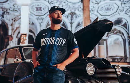
Detroit put out City Connect jerseys! The concept: jersey. The execution? Success! They are jerseys!
What They Did Right:
Webster’s dictionary defines uniforms as, “dress of a distinctive design or fashion worn by members of a particular group and serving as a means of identification”.
What They Did Wrong:
Releasing these to the public. The hat just says “Detroit”. Come on, man... The color is blue. Guys... We get it, you are the Motor City, but racing stripes down the front in a tire tread design? Lordy... And that is the entire concept! Especially given that the Tigers have minimalist uniforms and a basic color scheme (classic and great though!), this was the perfect opportunity to bring out something bright and fun and out there. Like Javy Baez, a swing and a miss.
Los Angeles Dodgers
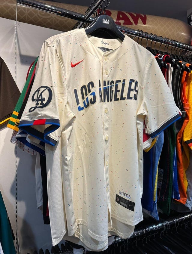
Los Angeles will be the first franchise to have a second City Connect jersey hit the field. While the official announcement is a month away, the jerseys were leaked this week by a fan in Japan.
What They Got Right:
These are better than the Los Dodgers original City Connects because anything is better than the Los Dodgers original City Connects.
What They Got Wrong:
Is this LAD logo supposed to be like a Disney D? If so, bad. If not, worse maybe? The paint speckle does nothing. The Los Angeles across the front looks like the DirectTV logo. LA has too much culture and too much history to go 0-2 on City Connect jerseys.
-WH
Follow @JonDowdBurner and listen to No Dowd About It! for more baseball content!


